Creating my logo with Opus 5.5
Eighteen versions of the 3h mark, made with Opus 5.5. The first twelve were drawn by eye against a reference. The last six were built from a grid and scored against a traced outline of it. The final mark is v17.
This logo was made with Opus 5.5, and it took 18 versions, not one prompt.
Drag across: the first version on the left, the final mark on the right, drawn in the same frame.
First, ChatGPT created images to use as reference:

The grid and the trace
Two things replaced judging by eye.
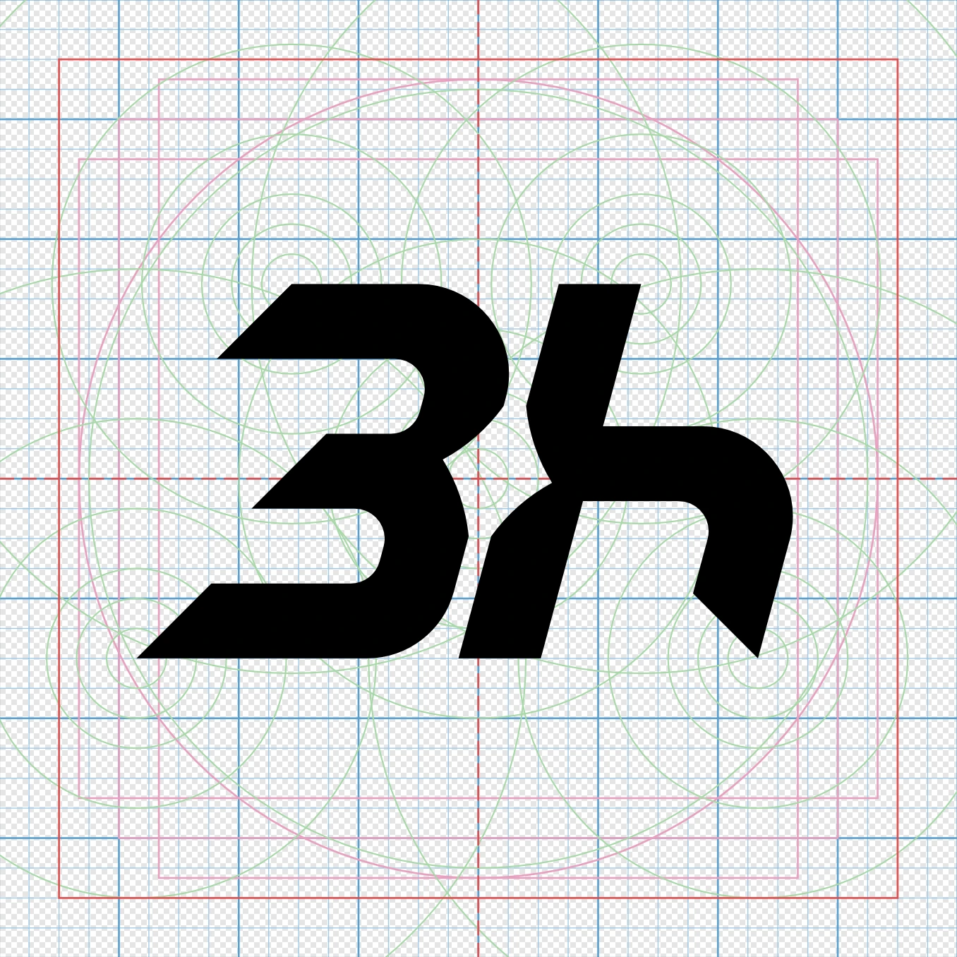
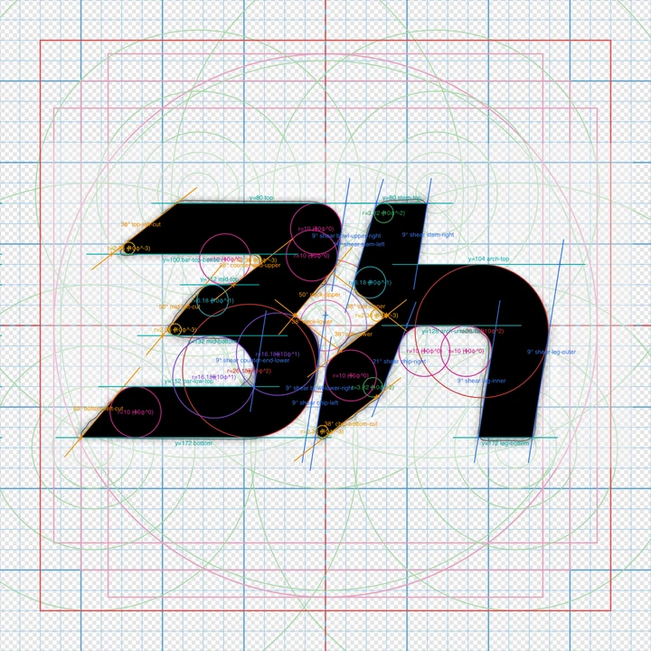
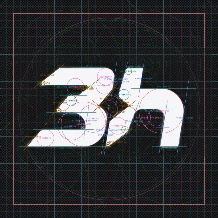
The first was a grid under the mark. Every curve sits on a circle from one set of circles, so the curves line up for a reason and not because they look close.

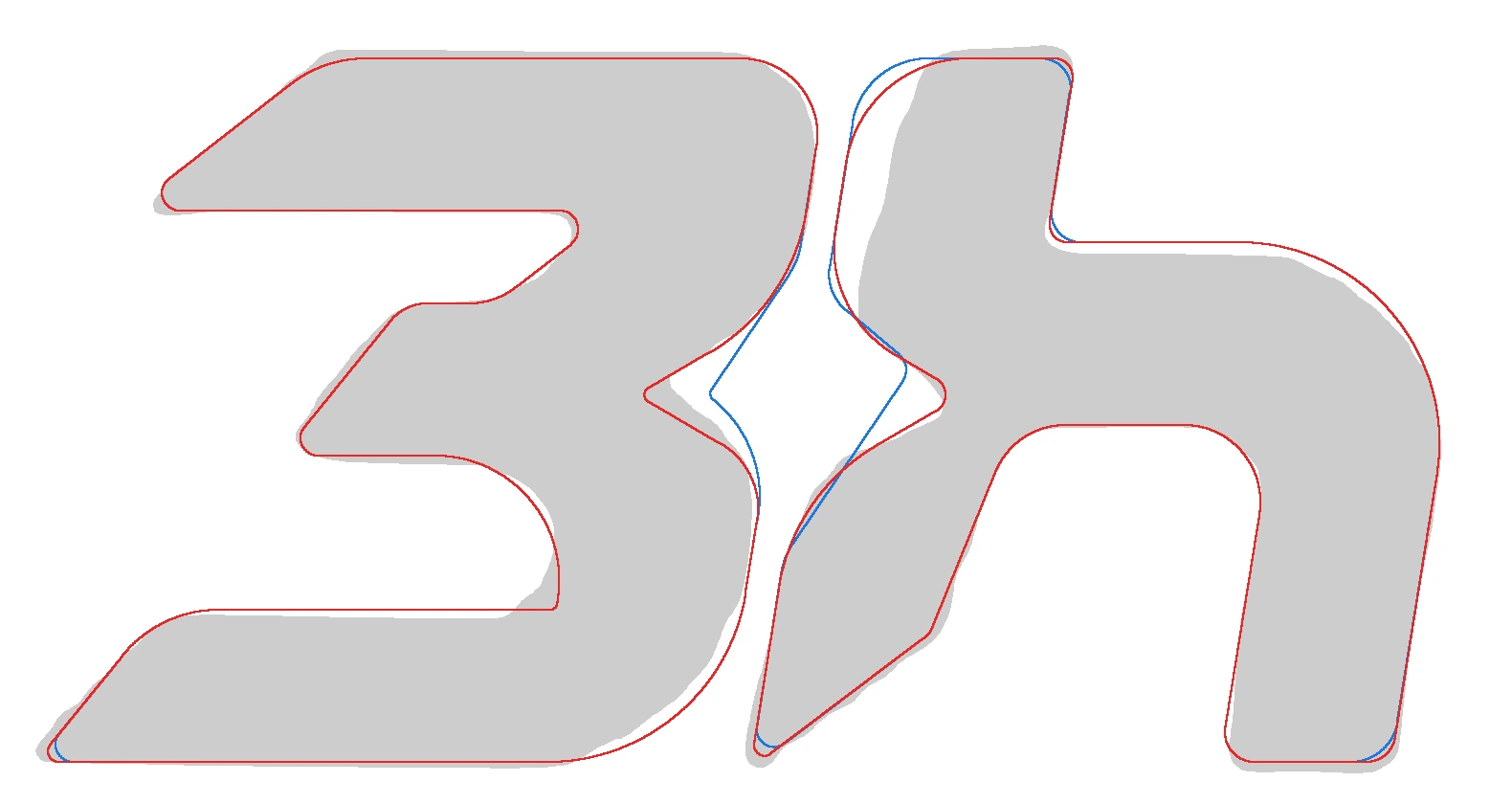
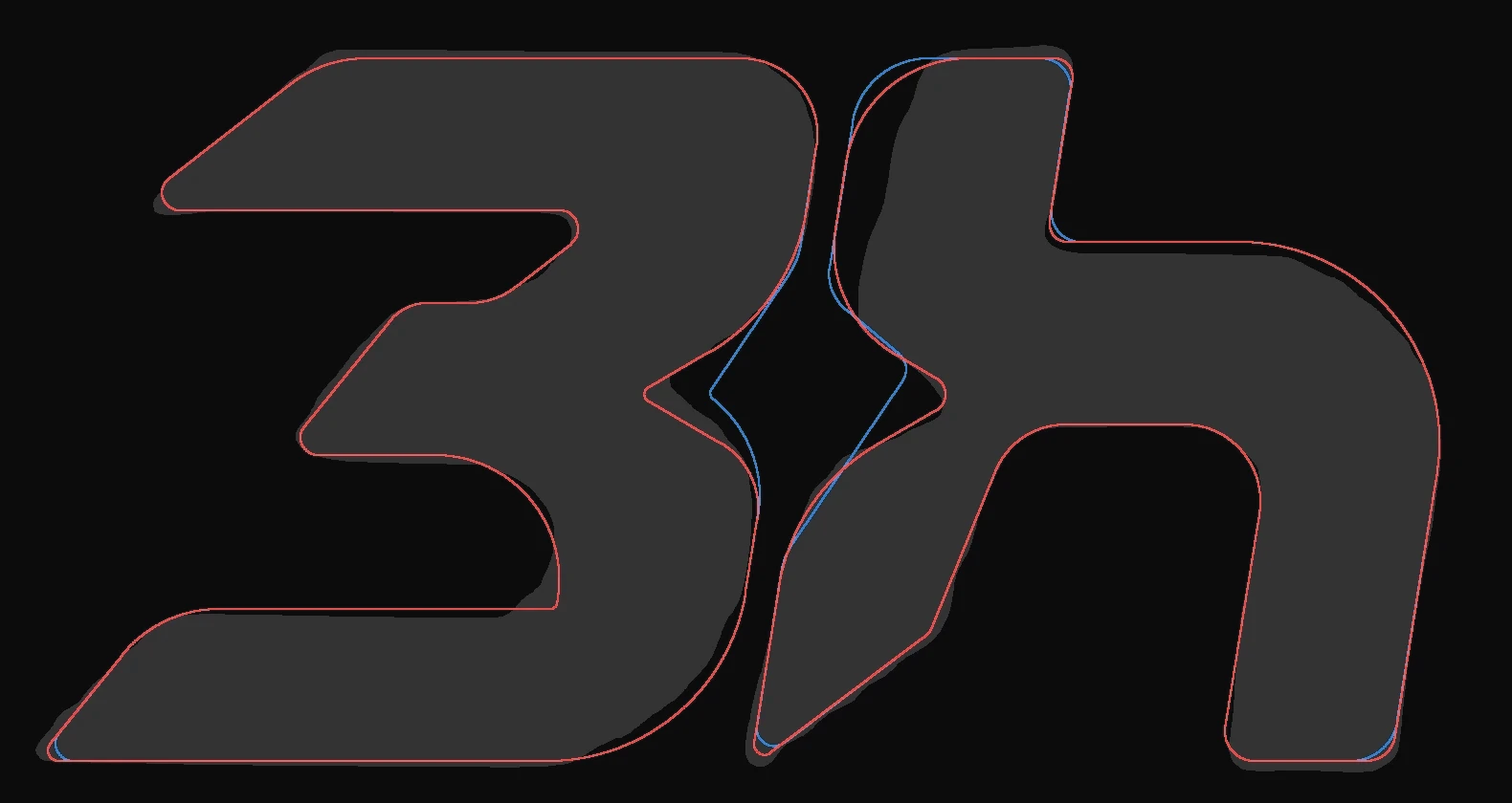
The second was a trace: an outline of the reference, laid under the mark. Every version was measured against it, which shows how much of the mark lies on the reference and where it leaves it.
Building it from math
The rebuild had three rules:
- Straight edges run at whole-degree angles.
- Every curve is part of a circle and joins the next edge smoothly, with no kink. The circle sizes follow the golden ratio, each about 1.6 times the one before.
- A score decides whether a change helped, so progress is read off a number and not argued from memory.
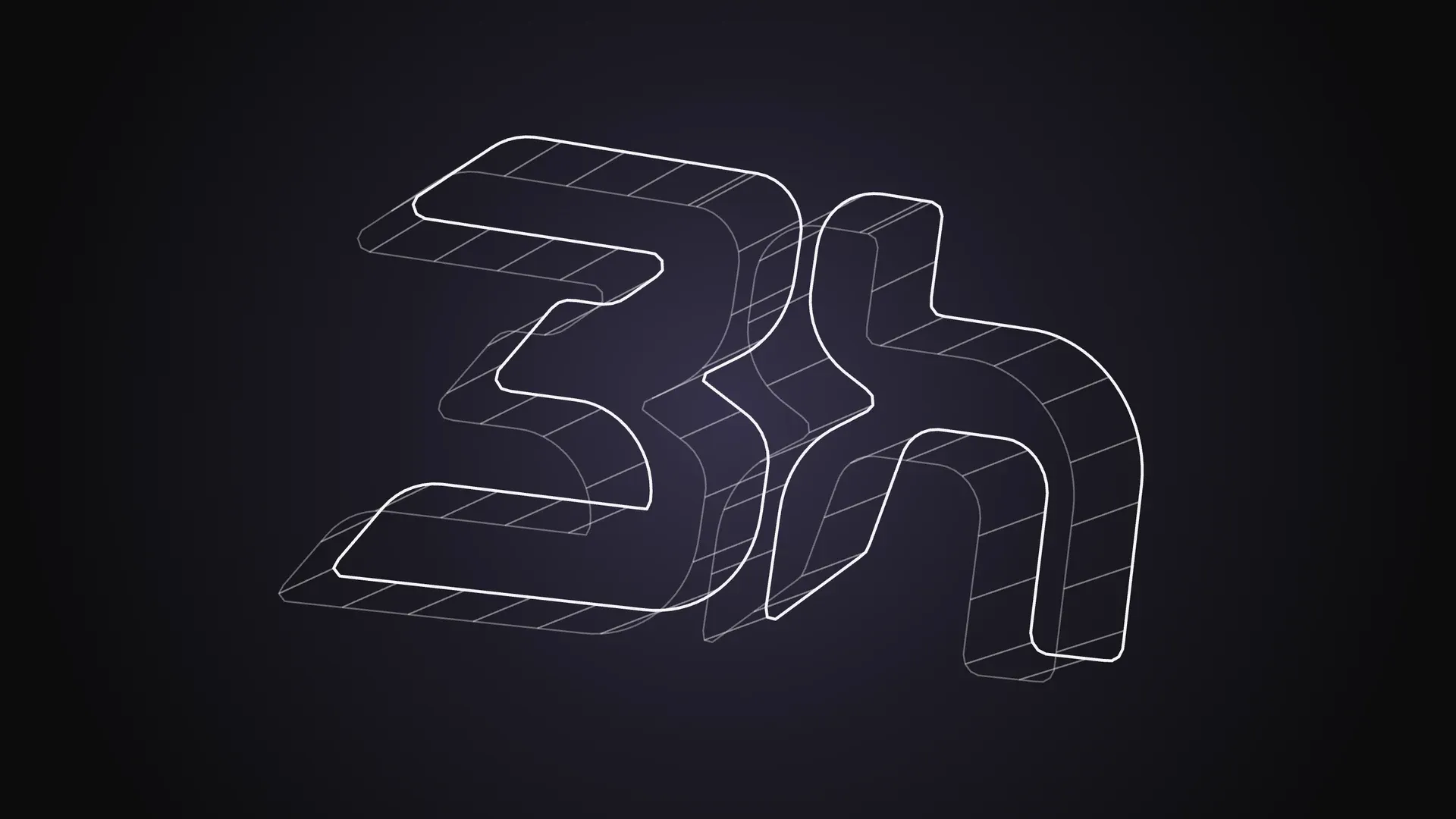
The same outline, pulled into three dimensions. Turn it.
Drag to turn the final mark. Edges only, built from the same outline as the flat version.
Scores
Two readings compare each version with the trace. Overlap is the share of the two shapes that lie on each other, so higher is closer. Largest miss is how far the mark’s edge strays from the reference outline at its worst point, in the drawing’s own units, so lower is closer.
| Version | Overlap | Largest miss |
|---|---|---|
| v13 | 0.936 | 3.45 |
| v14 | 0.920 | 4.12 |
| v15 | 0.908 | 7.54 |
| v16 | 0.911 | 6.64 |
| v17 | 0.924 | 6.02 |
The scores rise and fall.
- v13, the first built from rules, scored best.
- v14 made the two edges that face each other across the gap run parallel. The gap came out much wider than the reference’s, 7.86 against 4.50.
- v15 used the narrowest part of the gap as its width all the way along, with a square dent. It scored lowest. A rule applied too literally costs fidelity.
- v16 made the dent a diamond and rounded every corner, and the score came back.
- v17 turned the diamond on its side, long way across, as in the reference. It beat v16 on every reading.
v17 still sits below v13. It was kept because it holds the set gap width and the round corners that v13 lacks.
v18 stretched the tail of the h below the line. That brings the mark’s width to height to 1.62, within half a percent of the golden ratio. Over the part the tail does not touch, it scores 0.924, the same as v17. Over the whole mark it scores 0.893, because the trace has no tail. It was set aside: settle the shape first, extend it later.
What stays
Draw by eye until the shape stops improving, then stop. Put a grid under the mark, so every curve is a decision. Score against a trace of what is wanted, and read a dip as information. Round every corner. Settle the shape before extending it.
Every version
The full run, v1 to v18. Each picture follows the light or dark theme.
v1
v2
v3
v4
v5
v6
v7
v8
v9
v10
v11
v12
v13
v14
v15
v16
v17 · final
v18
Verdict
Eighteen versions, two stretches. The first twelve were drawn by eye and showed what the mark should not be. The last six were built from a grid, whole-degree lines and circle arcs, and scored against a trace, which showed what each rule costs. The mark is v17.
Responses
Keep reading
Claude Code usage limits: what burns your quota and how to stretch it
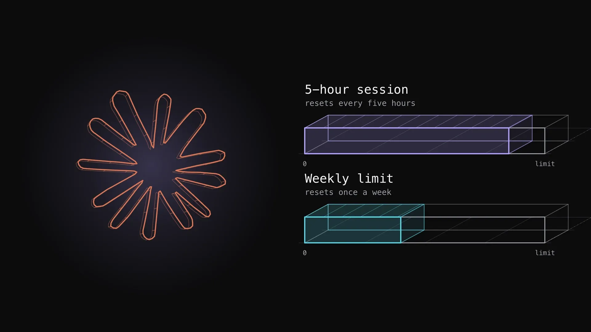
What the Claude Code five-hour and weekly limits are, how they show up, what spends them fastest (long context, large tool output, parallel agents, model choice, retries) and the documented ways to stretch them, with one measured plan week.
How to optimize your website for SEO with Claude
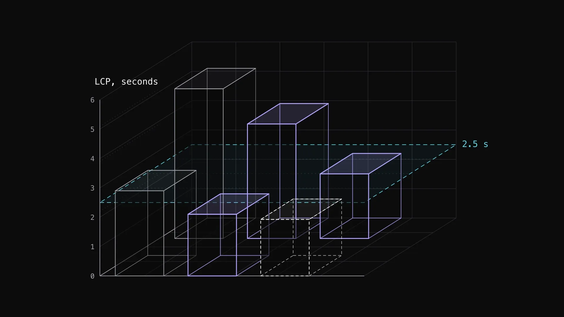
A measure-first SEO pass on two live sites: field data against Lighthouse, an HTML audit, and the fixes that cut LCP and fixed canonicals. Then what else to check on your own site.
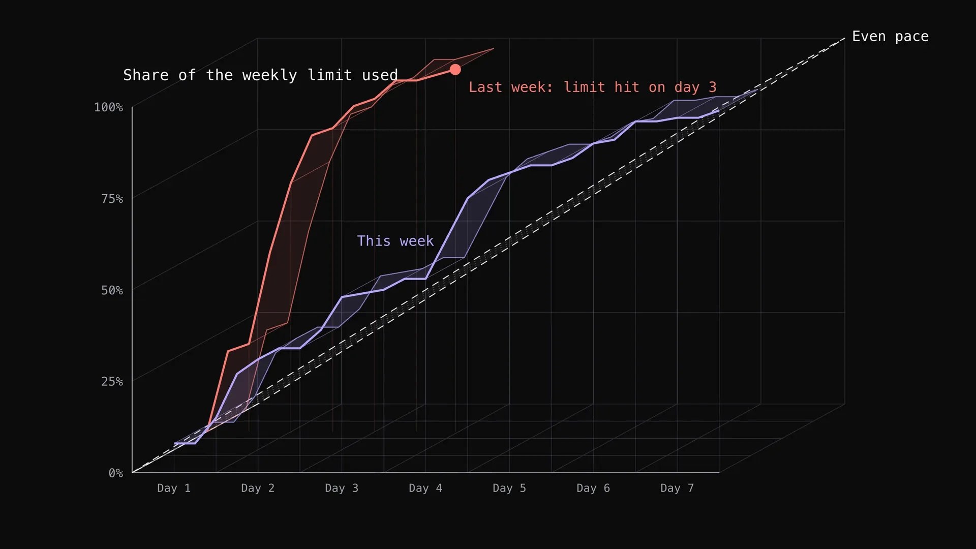
How to pace your Claude subscription to survive the week
My Claude weekly limit ran out on day 3 one week and lasted all seven days the next. What changed: a simple wait rule for the strongest model, and the cheaper model doing more of the work, with the real usage charts.